This post went viral because it's a hilarious and relatable cultural observation. It perfectly captures how a small detail like a font can trigger a vivid, anachronistic imagination, especially when traveling between culturally rich nations like Korea and Japan.
Japanese historical dramas (Jidaigeki) are a popular genre, often featuring specific visual styles, including fonts, that are instantly recognizable to Japanese audiences. The humor stems from this strong association being unexpectedly triggered on a modern Korean airline.
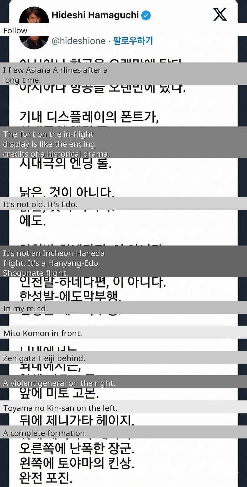
A recent post by a Japanese passenger about their Asiana Airlines flight has gone viral in Korea, sparking laughter across the internet. The passenger was highly amused by the font used on the in-flight display, which they immediately recognized as a classic 'Japanese historical drama font' – specifically, one reminiscent of Japan's **Edo period**.
Their imagination took flight, transforming the modern journey from Incheon to Haneda into an epic voyage from **Hanyang** (old Seoul) directly to the **Edo Shogunate**. In their mind, the cabin was filled with iconic characters from Japanese historical dramas: **Mito Komon** in front, **Zenigata Heiji** behind, a 'violent general' to the right, and **Toyama no Kin-san** to the left, forming a complete, anachronistic entourage.
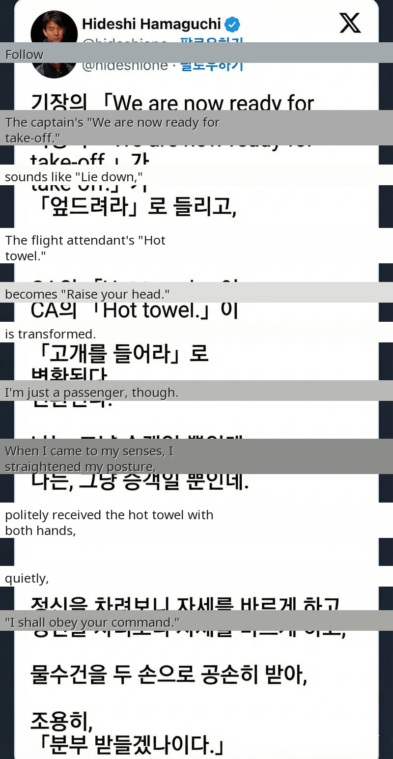
The captain's standard 'We are now ready for take-off' morphed into a dramatic 'Prostrate yourselves!' and the flight attendant's 'Hot towel' became a regal 'Raise your heads!' The passenger hilariously recounted how they instinctively straightened their posture, politely accepted the hot towel with both hands, and mentally responded, 'I shall obey your command.' This delightful cultural clash, triggered by a simple font, perfectly captures the power of design to transport us, even if unintentionally, to another time and place.